

Newsletter of Danny Merkel - Issue #122

A major theme this year has been that while the S&P 500 appears strong, there’s a lot weakness beneath the surface.
Similar to a car’s engine not firing on all cylinders, there are problems under the hood in today’s market.
The Russell 2000 illustrates this problem. As I mentioned last week, there is strength in the chart below, but it doesn’t last.
For example, notice how the index does manage to become overbought (red circles) but never manages to remain overbought:
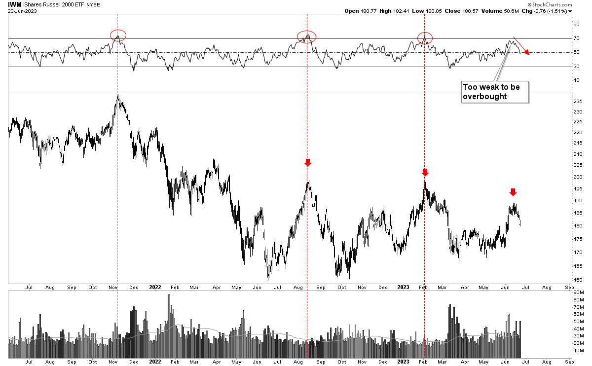
In a normal bull-market, price should become overbought and stay overbought. That’s not happening.
The most recent rally was actually too weak to even register an overbought reading before falling apart once again.
In addition, notice that the bulls failed to push price to a higher-high. This now forms three lower highs (red arrows).
Overall, the Russell 2000 is lower today than it was 2 years ago, lower today than its August high and lower today than its February high.
It’s incomprehensible to me how anyone could call this a healthy, broad-based bull market.
To provide contrast, let’s examine a real bull market in the past. Back in 2013, the market was healthy and the Russell 2000 back then looked very different from today:
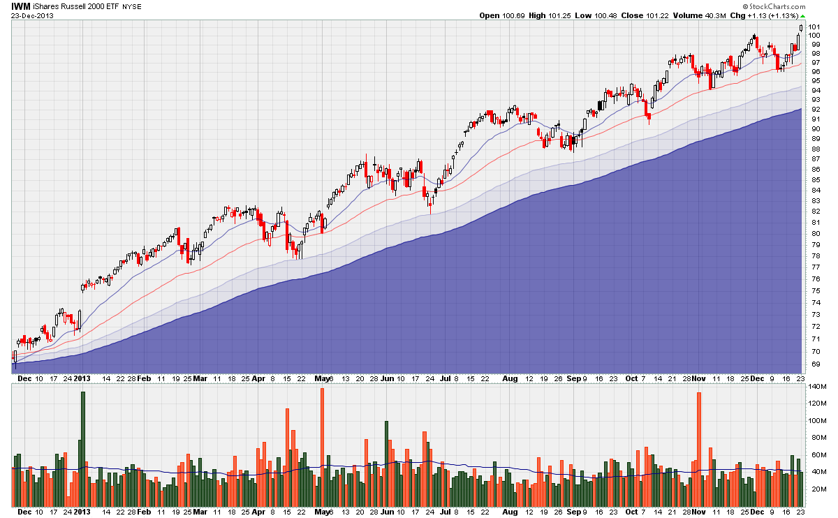
Notice how the chart starts in the lower-left and rises towards the upper right. Notice, also, how the index formed higher-highs all year long.
Furthermore, the long-term moving averages (solid blue zones) rose smoothly throughout the year.
Finally, notice how the Russell 2000 today is doing none of those things.
Interesting ETFs:
Given how unhealthy this supposed bull-market is, it makes sense to find alternative investments.
There are thousands of ETFs to choose from, so finding alternatives has never been easier. But with so many different funds, how can one narrow down the list and find the best?
A simple way to isolate ETFs in uptrends is to scan for new all-time-highs.
A new ATH is a sure sign that something is trending higher. To be clear, though, ATHs don’t cause uptrends and don’t necessarily mean that the uptrend will continue but, rather, demonstrate that an uptrend is taking place at this moment.
Here’s an interesting example to visualize what I mean: when you started reading today’s newsletter, the world’s population hit an all-time-high. It’s hitting another ATH now and will hit another ATH by the time you reach the end of today’s newsletter.
New highs aren’t causing or predicting an uptrend, but are a symptom of an uptrend currently in progress.