

Newsletter of Danny Merkel - Issue #141

Market Review:
Okay, wow, the bounce that David Ryan called for last week happened in a huge way. I’m sure a lot of people are amazed by the accuracy of this call, but a sample size of 1 doesn’t prove much.
And, of course, luck is a factor. There were many fundamental events that unfolded this week that could have easily gone the other way. David Ryan does have a tremendous amount of experience, so I wouldn’t say it’s all luck, but luck does play a larger role in trading than most realize.
Anyway, a bounce isn’t exactly a rare event. As I’ve noted before, growth stocks have formed many such bounces over the past 3 years; the trouble is that they never last:
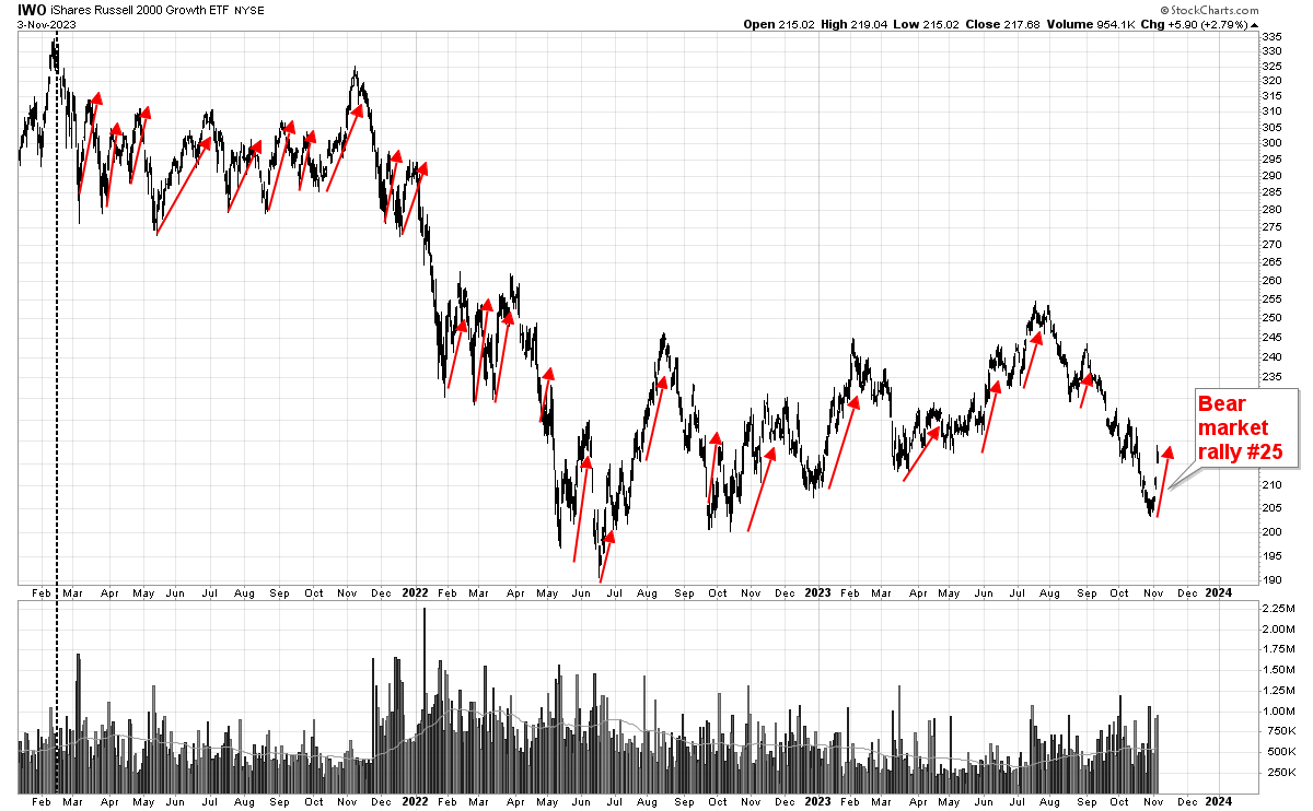
I had the great misfortune of starting this newsletter on February 15th 2021, which was the exact top of the bull-market (dashed vertical line).
Since that time, growth stocks have been “jack-rabbiting” up and down neurotically in what I have called a profoundly challenging market. To think that all growth stock traders have been swimmingly navigating these cross currents is delusional. The vast majority of traders are down massively over the past 2 years.
Another headwind this year is that momentum trading has stopped working.
For instance, the iShares Momentum Factor ETF has been like a ship without a rudder all year:

Every rally fades, so MTUM has printed exactly zero 52-week-highs this year. This week’s rally appears to me like panic short-covering and short-covering rallies never last. There’s no volume, no chart pattern, nothing but a manic, panicky rally.
Momentum trading is based on the principle that what has gone up a lot will continue to go up. This thinking may sound primitive, but there is strong evidence that momentum has worked going back hundreds of years.
Although the MTUM fund has stagnated this year, it has enjoyed robust performance going back to the ETF’s inception in 2013.
The chart below shows MTUM as candles. The black line shows the S&P 500 top 50 fund, which has been one of the top-performing ETFs over the past 10 years.
I chose XLG to provide Momentum with tough competition, given that big-tech has been so strong. And yet, MTUM was able to handle this challenge, racking up big gains and keeping pace.
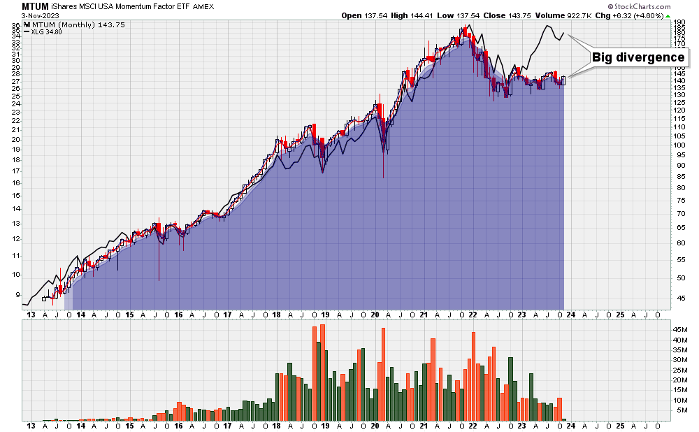
However, something interesting happened only this year: MTUM and XLG have diverged.
While big-tech continued higher this year, MTUM has sat the rally out and is actually down for the year. This persistent and widening divergence is, in my opinion, a major headwind to breakout trading.
S&P 500 Analysis:
Outside the world of growth stocks and momentum, the general market looks much rosier.
Firstly, the long-term trend of SPY is up, so there is absolutely no reason to be overly bearish or to even think about shorting:
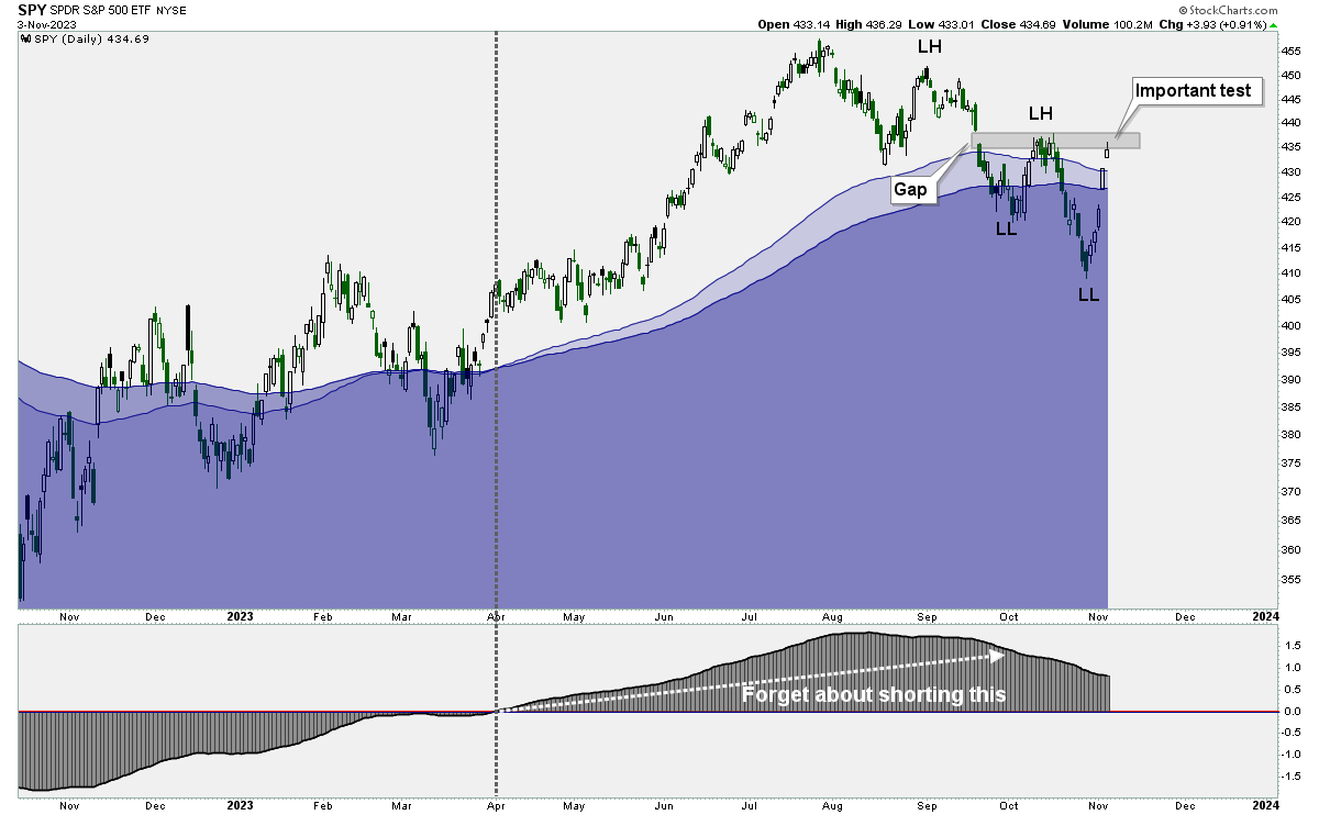
While the long-term trend is up, the short-term trend remains down, despite this week’s rally.
From a purely classical charting perspective, SPY is still forming lower-lows and lower-highs.
But this short-term downtrend can easily be disproven if price simply rallies beyond it’s previous high.
Historical Charts:
For many, this year has been a normal bull-market and it’s just been business as usual.
My view has been that - at best - this has been an extremely weak bull-market. In order to illustrate what I mean, let’s go back in time and see what a real bull-market looks like:
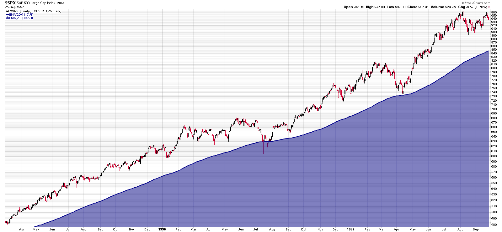
The chart above shows the S&P 500 during the mid-1990s. The blue zone shows the 200 day-moving-average.
Notice how the 200dma consistently trends higher and how the index is able to respect and hold the line.
Fast forward to today, and you may notice that today’s market looks rather different.
One inconvenient fact is that the S&P 500 is lower today than it was 2 years ago. I know traders who have been 100% bullish for the past 2 years, and yet the market hasn’t gained an inch. That’s pretty weird.
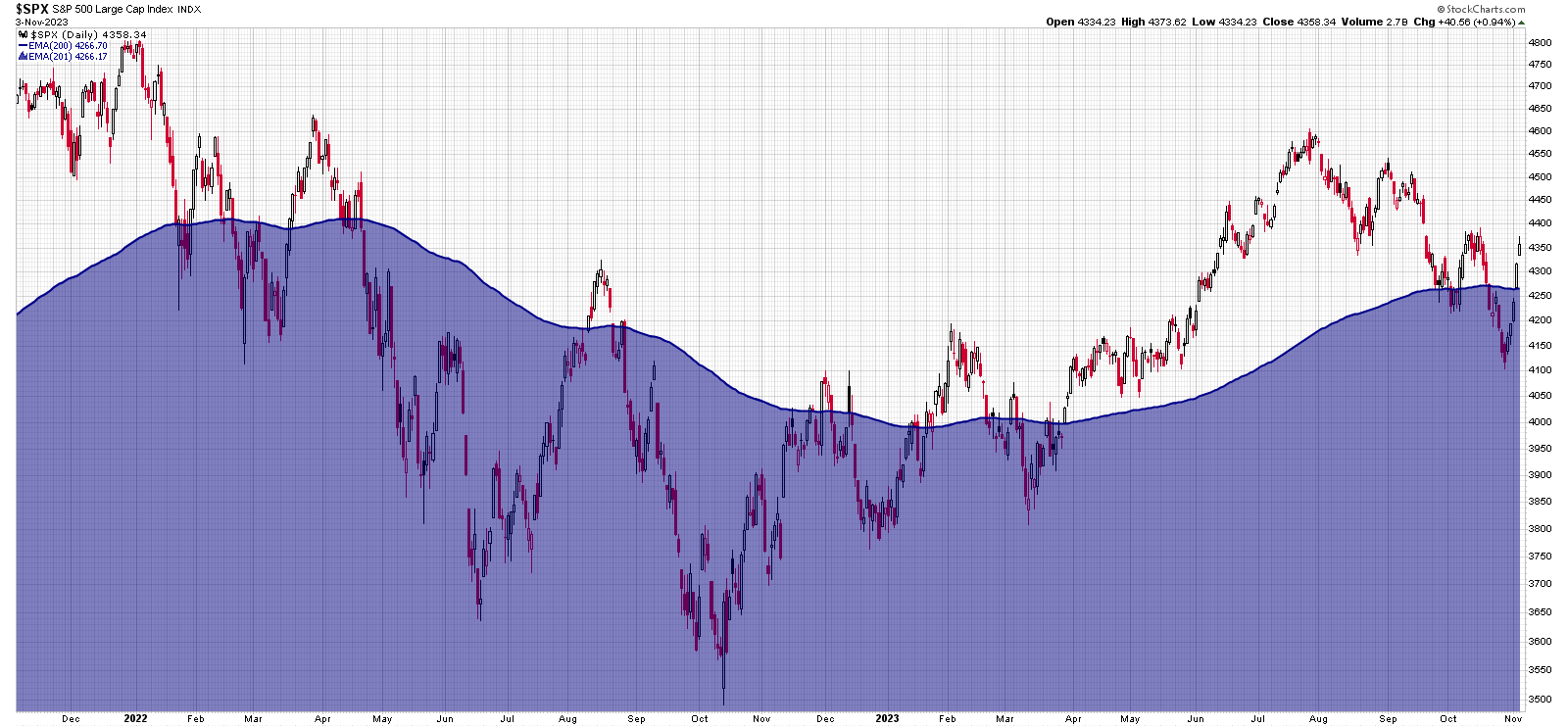
Secondly, notice how consistently the index fails to hold the 200dma. Every time the bulls take price above the blue zone, it fails to hold and price keeps slipping back below.
Compare and contrast the two charts again and keep in mind that breakout trading works best in a strong bull-market.
Currency Analysis:
The US Dollar took a hit this week. The bigger picture, however, remains strong and to help illustrate this here’s something new: a point and figure chart:

Going back to the year 2005, this big picture P&F chart can reveal strength and weakness that may not be otherwise evident.
For instance, the USD Index broke through a perfectly defined quadruple top back in 2015 (first red arrow).
From there, the greenback consolidated, forming a massive base. The base eventually led to a second breakout (second red arrow).
In spite of this week’s pullback, the breakout remains intact and price continues to be in a column of Xs.
Interesting ETFs:
If you’re a long-time reader of this newsletter, you probably have noticed that I believe in certain core principles such as:
Never bet against the S&P 500 (it’s a Trend-Following index)
Never fight long-term trends
Never buy options
Always trade small positions
Cut losing trades systematically
Amazingly, I recently found a new ETF that combines all of these core principles and then does the polar opposite of that!